
I created a design library as a source of truth and to promote consistency from design throughout development. The library consists of the brand elements and essential components parts first, breaking down to the specific pieces that make up each component. This organization scheme was heavily inspired from Brad Frost's Atomic Design principles.
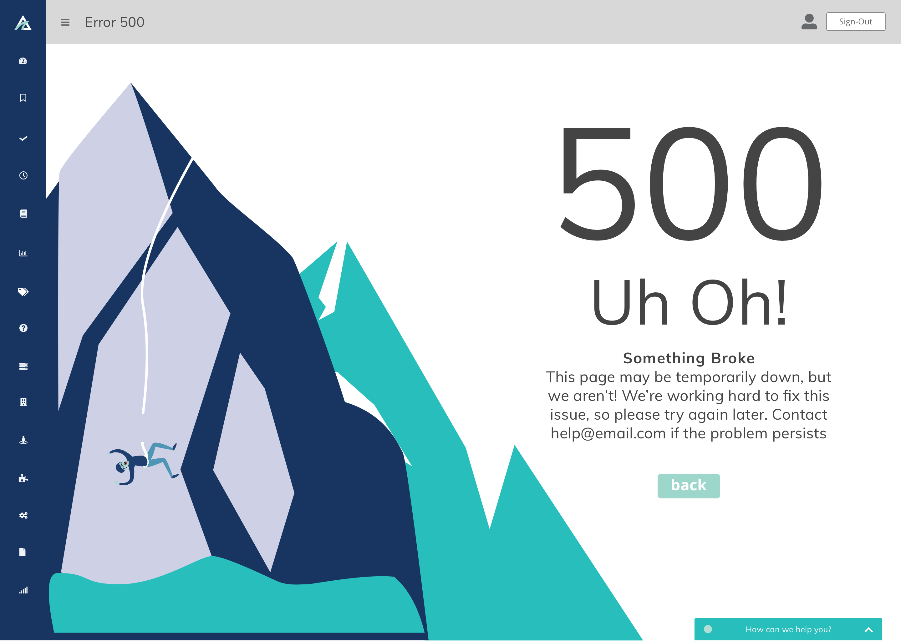
During my User Interface Designer Internship at Ascent I quickly adapted to the team workflow in place. The designers used Sketch as the primary tool to try out new ideas and for static-mockups. We coupled Sketch with Invision's Craft plugin to create high-fidelity clickable prototypes. The developers could then view the files in Invision and use the inspect tool for padding/margin measurements and code snippets. At first, both the development and design teams were lacking consistency in design.
I set out to solve this issue by creating a design library as a source of truth and making slight changes to the workflow to promote a strong relationship between designers and developers.
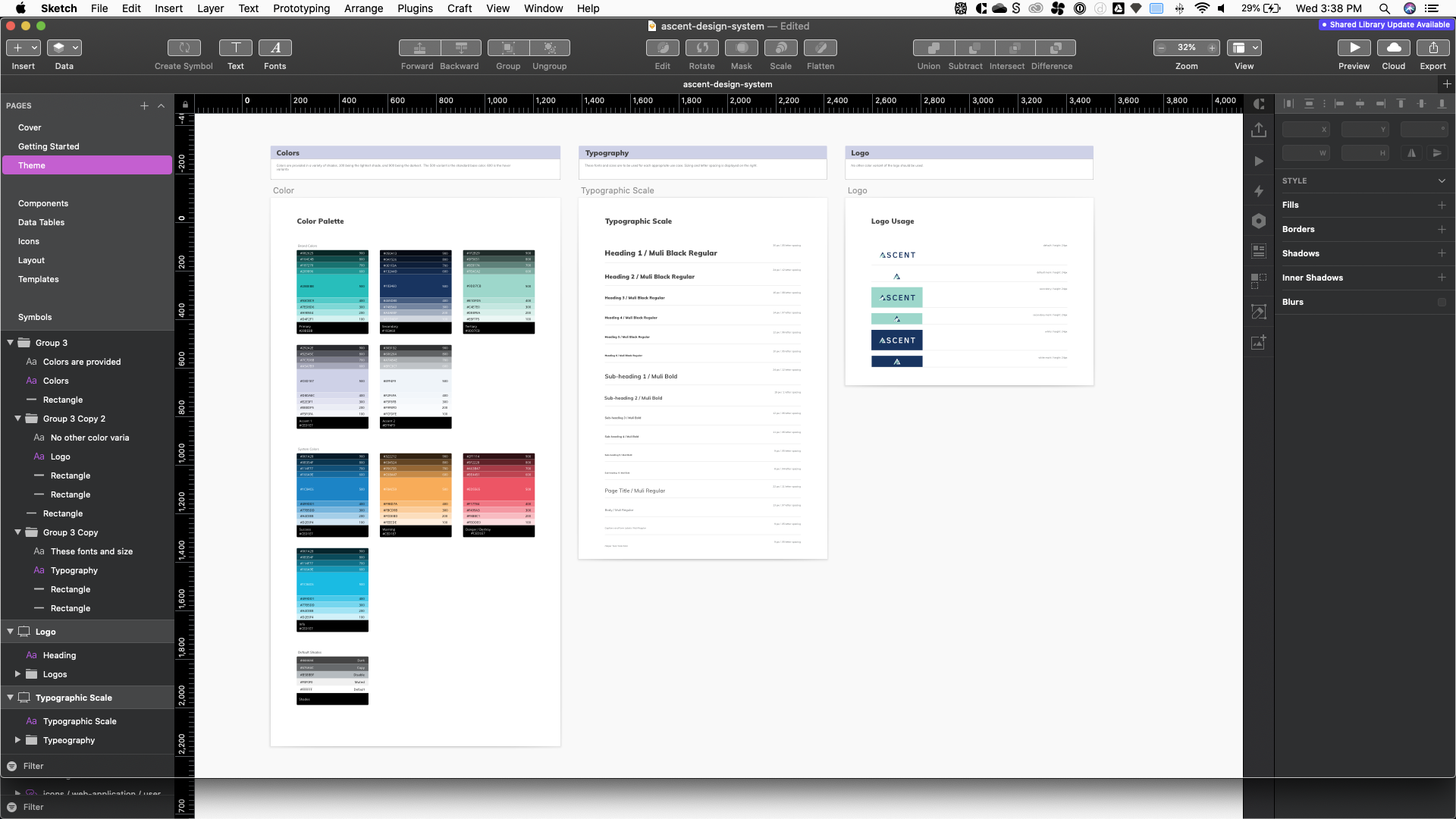
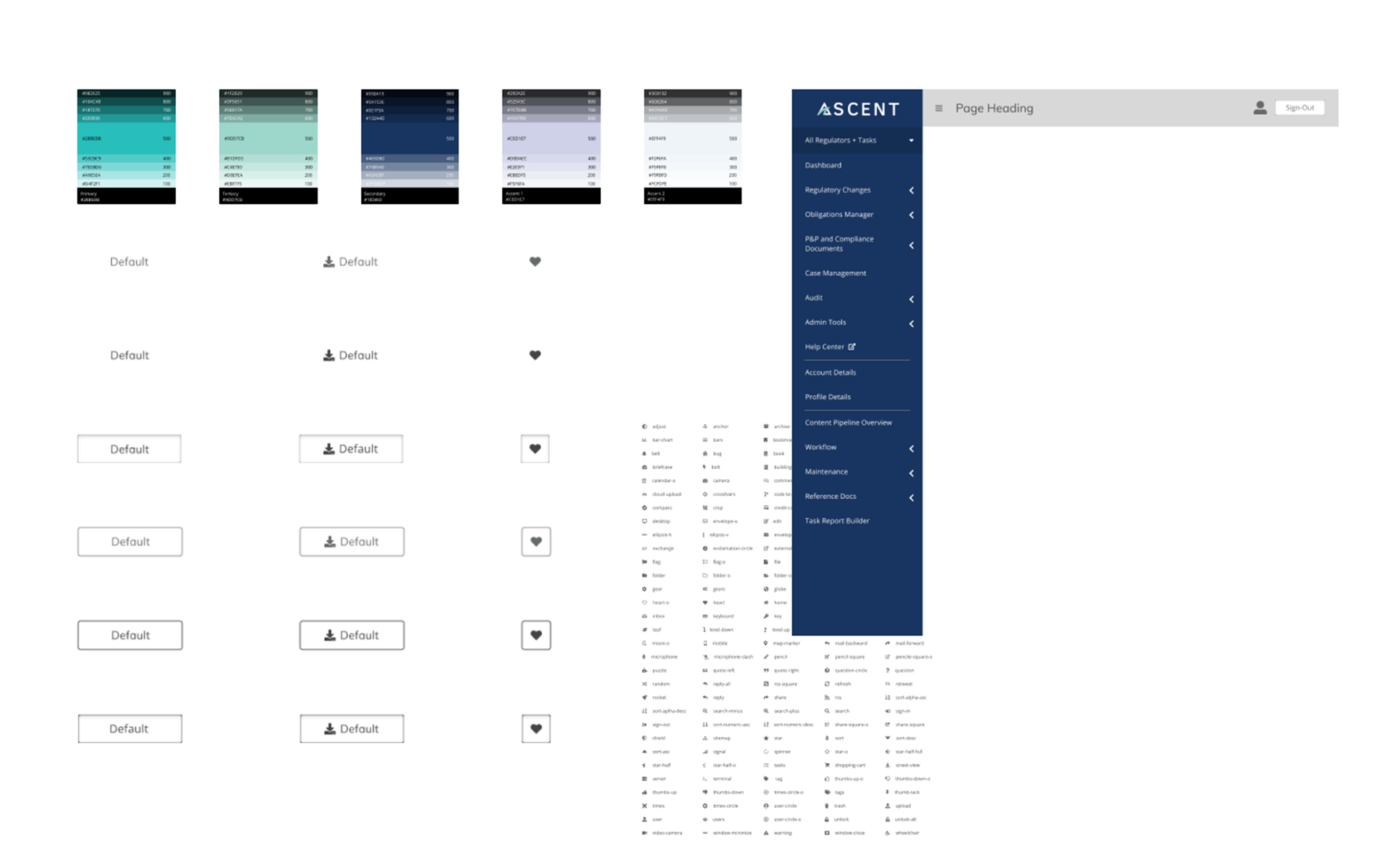
I began with a user manual that would help new designers and developers that are just joining the team learn to use the design library and contribute to it. Next, I added the brand colors declared in the company's Brand Standard's Manual. Each color is separated into lighter and darker shades to provide a higher level of customization to components since each use-case can vary. The typography scale is broken down into headings, subheadings, body-copy, and tool-tip text - just to name a few. Having a consistent color scheme solved issues that would occur when the final design had a color that was slightly off from the prototypes. The logo usage is also found along with these other elements.
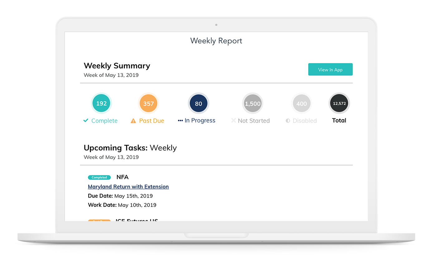
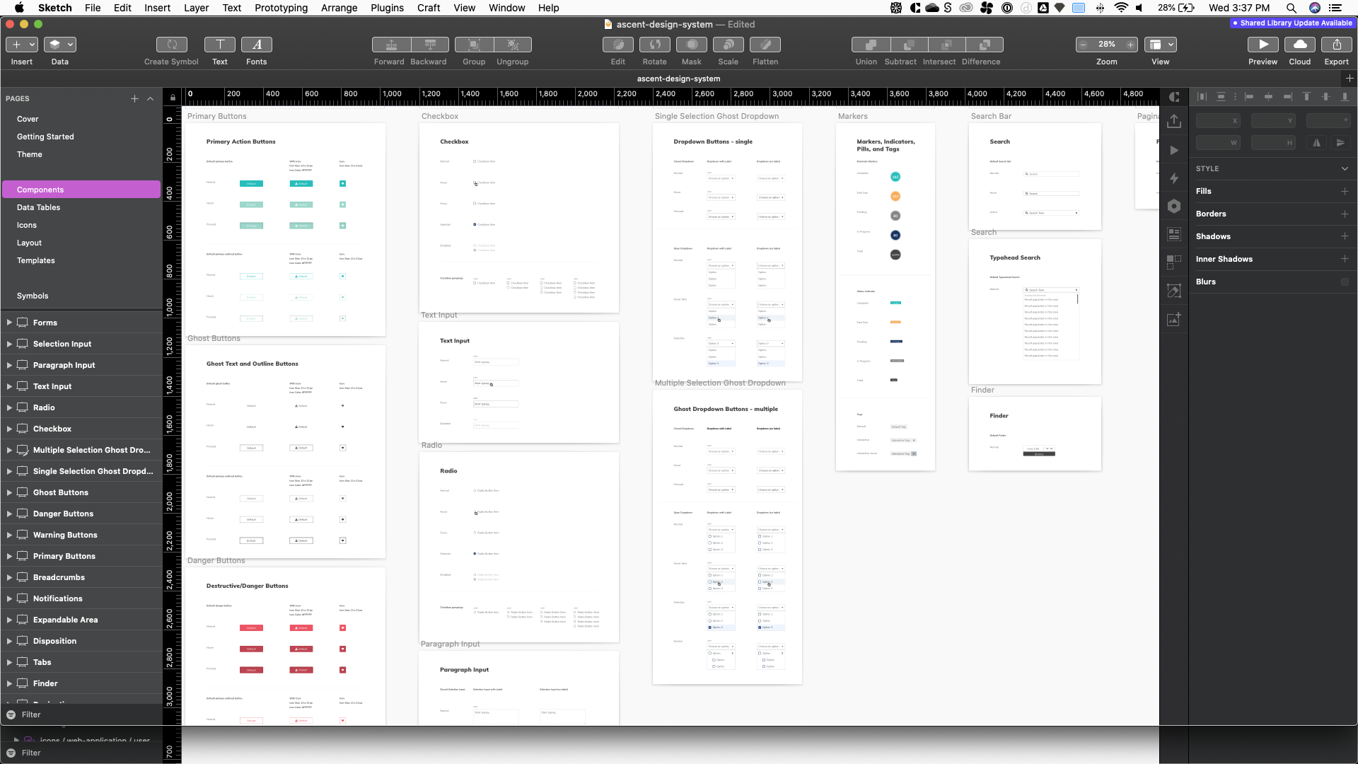
The core components are next (I separated each major part of the design library into its own page). The components are displayed on a sticker sheet. Each component is a symbol or combination of symbols (nested symbols). These components serve as the source of truth when designing. Since the library is readily available, the components can be easily customized depending on the use-case. This change to the workflow meant that we did not have to design from the ground up since the core elements are already defined and ready to use from the design library (it was super exciting!).
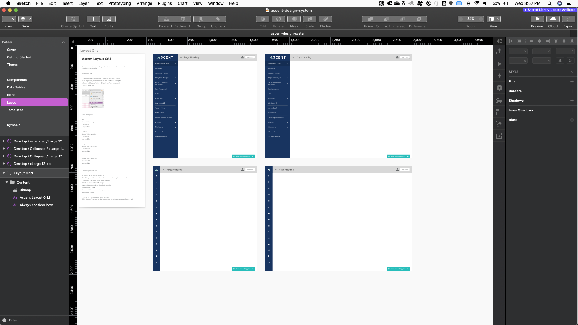
I also built a custom layout scheme using a standard 12-column grid and 8pt baseline grid. Margins and the specifications to the grid layout are defined on the page. To ensure the components don't "break" I designed them to be flexible when resizing to the specified breakpoints in the design library. Since the application is not yet supported on mobile devices I focused my attention solely on desktop layouts. I found that 8pt grid system works great on desktop and keeps the designs consistent and flexible at the same time.
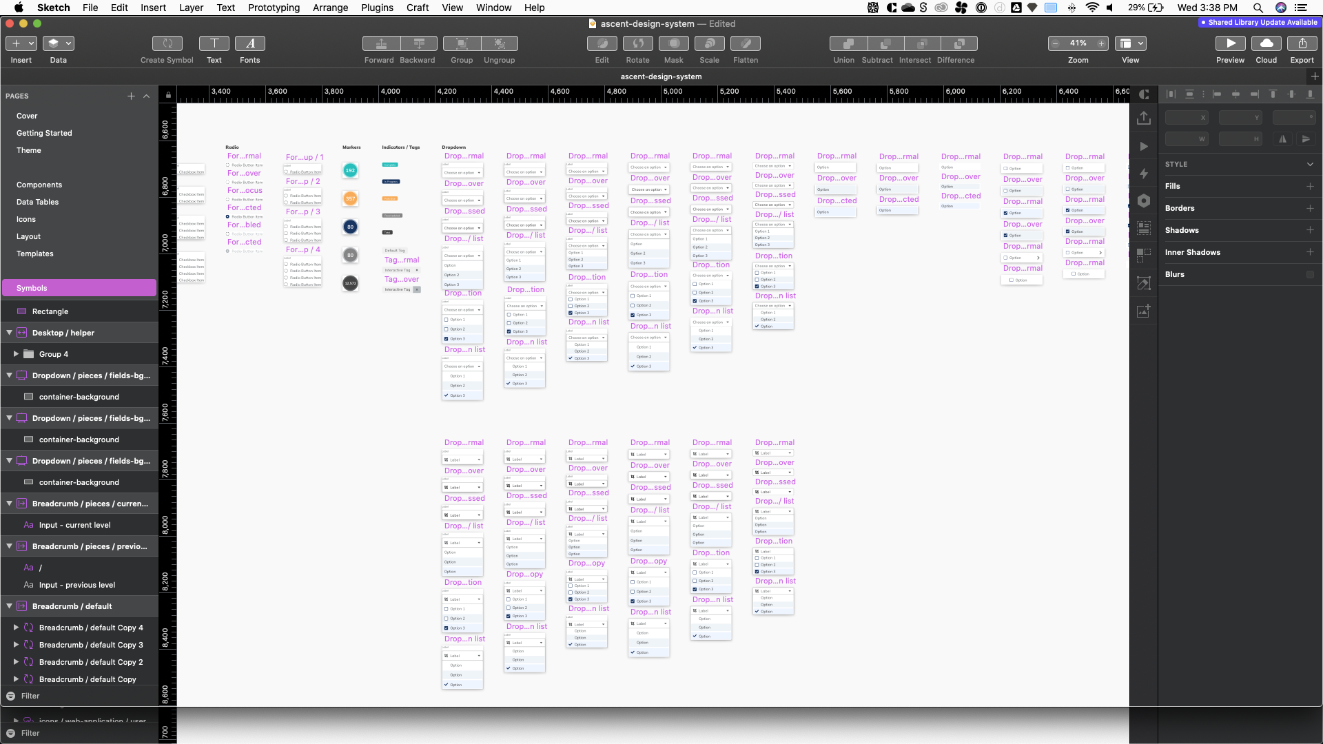
The most difficult aspect of the design library was keeping the symbols very organized and easy to identify since I wasn't the only one using the library for my designs. I named my components first by the component type and size. I created sub-categories labeled "pieces" that consisted of each symbol that made up the component to provide more customization - I found this especially helpful for creating data tables, each with different use-case scenarios. Over time the symbol page became very large and more challenging to manage so naming them had to be very specific. Keeping track of changes was also essential because a small change in the library could go unnoticed and alter the designs the team has built based off the library's symbols. I found applications such as plant and abstract, and even sketch's cloud versioning was key to keeping track of changes.
Now that the source of truth for design was established across across both teams I wanted to ensure that the developers would be able to contribute to our sketch files and that the library would as closely match the code as possible. I introduced the development team to react-to-sketch app designed by airbnb. The extension would allow the developers to import any components they may have built in their coding environments into the sketch design system file. The design team can take these designs built from code to make changes to the library so that both environments are mirror images of one another. HTML, CSS, and React native code snippets could be exported to the developers along with precise measurements using Invision's inspect tool. As the library matures plans are in place for integrating the sketch library with a storybook.js project which would strengthen collaboration between designers and developers even more.